Swapfiets
Redesign Price Breakdown

Project Overview
Swapfiets, an Amsterdam-based company, provides a B2C bike subscription service across eight European countries.I joined Swapfiets in 2023 as an intern and have since advanced to the role of UX Designer. My primary focus has been improving the website's user experience through close cooperation with the Marketing team and developers.
Overview
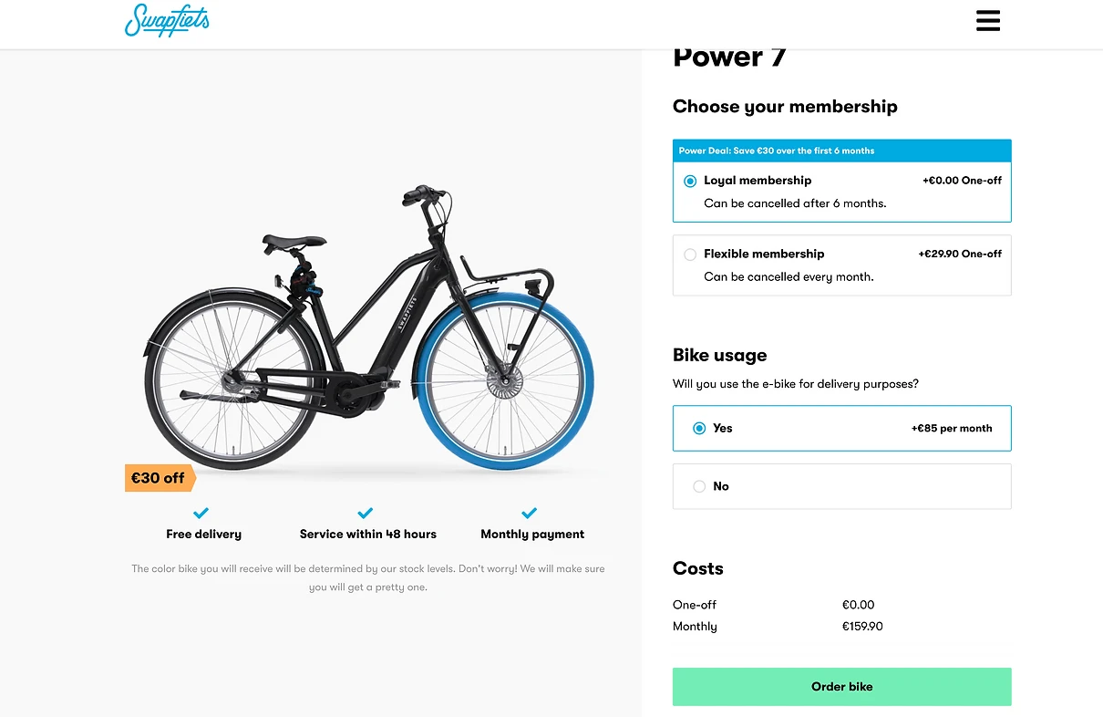
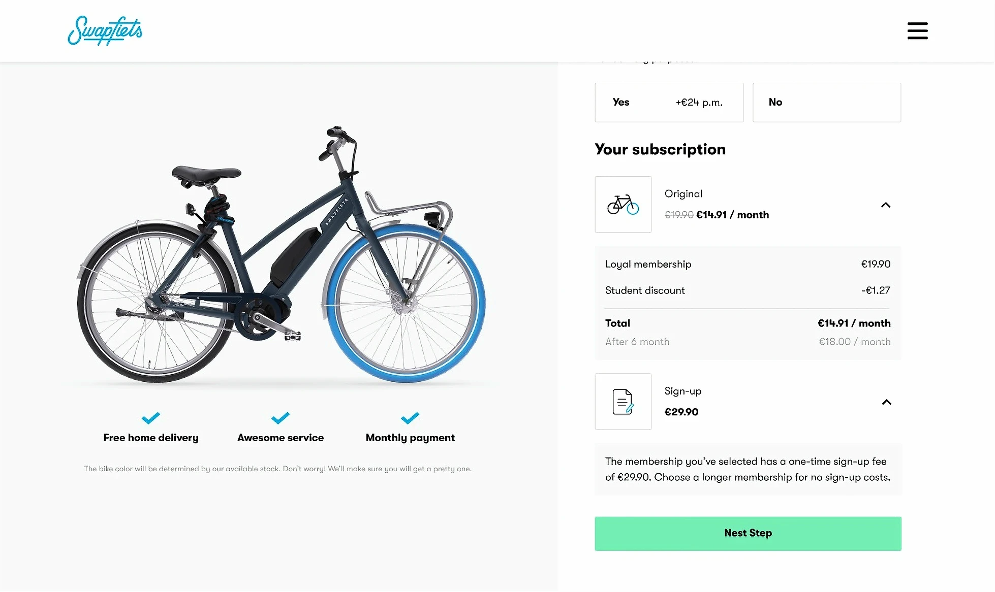
The current price breakdown lacks detailed subscription information, including various discounts and membership types. Redesigning the price breakdown will provide users with a clear understanding of their payment details.
Key Result: Improved Sign up experience, measured by increased conversion rates.
Project goal
Enable users to configure their subscriptions and view a clear overview of their upcoming payments.
Process
Define
Define problem
Prototype
Ideate | UI design
A/B Testing
A/B Testing | A/B Testing result | Next step
Define
Define problem
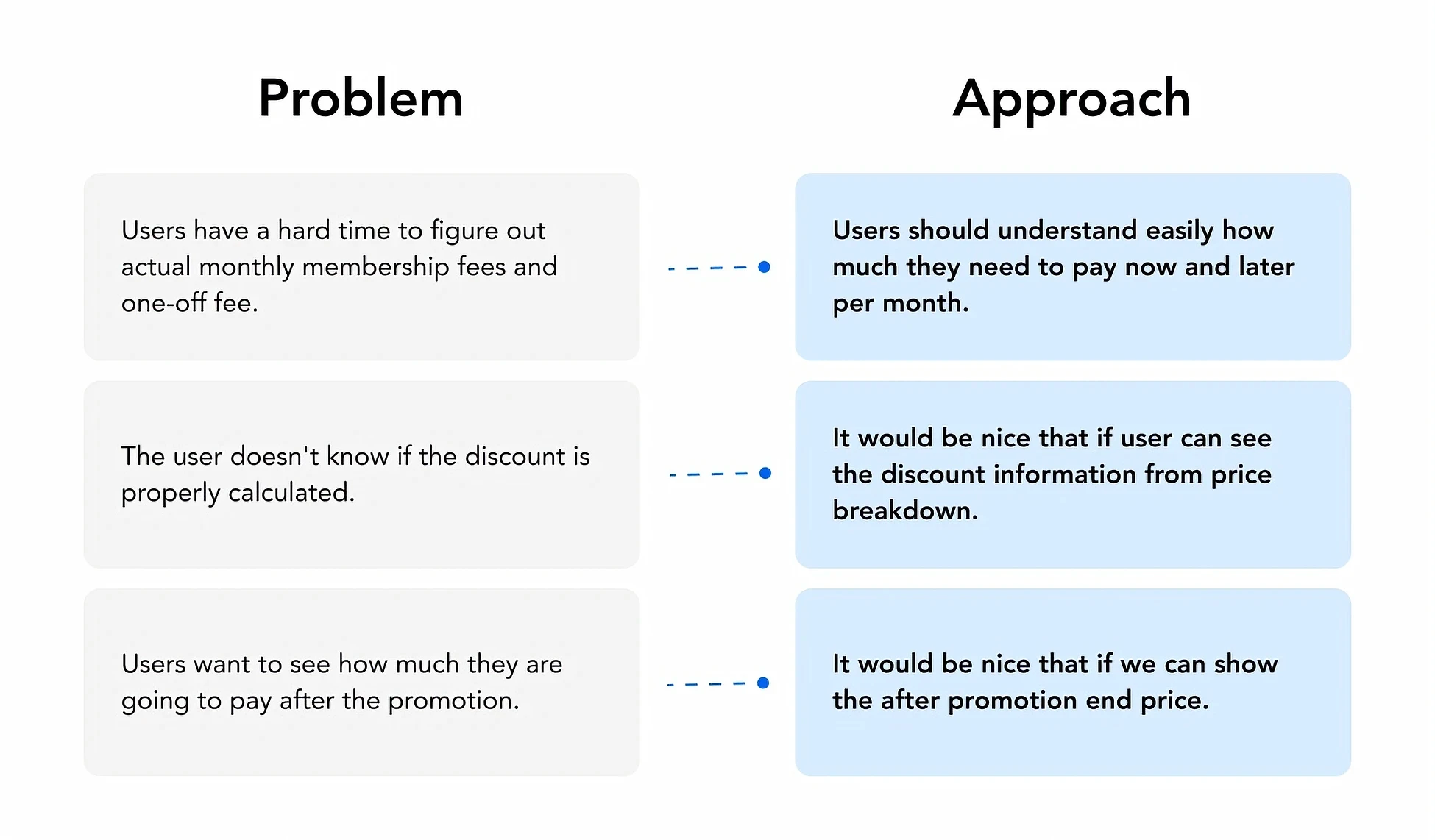
To improve the price breakdown design, I need to identify the main issues with the current price breakdown. After creating a user journey map and conducting competitor research, I discovered several pain points.
Must have
Users have a hard time figuring out actual monthly membership fees and one-off fees.
The user doesn't know if the discount is properly calculated.
Nice to have
Users want to see how much they are going to pay after the promotion.
Opportunity
To identify potential solutions, I developed specific approaches for each problem. This helped me to easily determine the best solution direction.
Prototype
Ideate
After conducting pattern research, I designed the layout and determined the key information to highlight for users.
It was quite challenging because we had different promotions for each bike model.
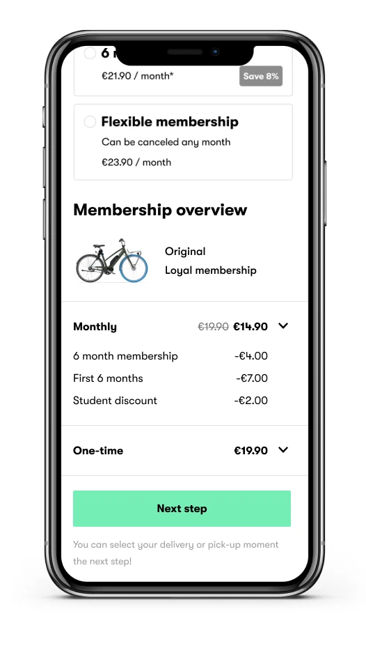
Approach 1
Combination of membership overview and price details
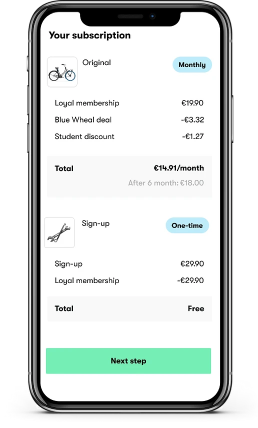
Approach 2
After promotion price with clear price division
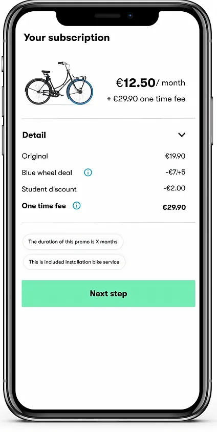
Approach 3
Simplifed price breakdown with details and tags
Design challenges
Designing the Swapfiets price breakdown wasn't easy due to multiple promotions per city and bike model. The biggest challenge was how to make the price breakdown clear and visually neat. After discussions with other designers and developers, I still found more challenges with the current approaches.
One-time fee
We still need to provide a proper reason why the user needs to pay a one-time fee. The user might be confused about the difference between the one-time and monthly fees.
First 6 months discount
Users need to calculate by themselves after 6-month discount price.
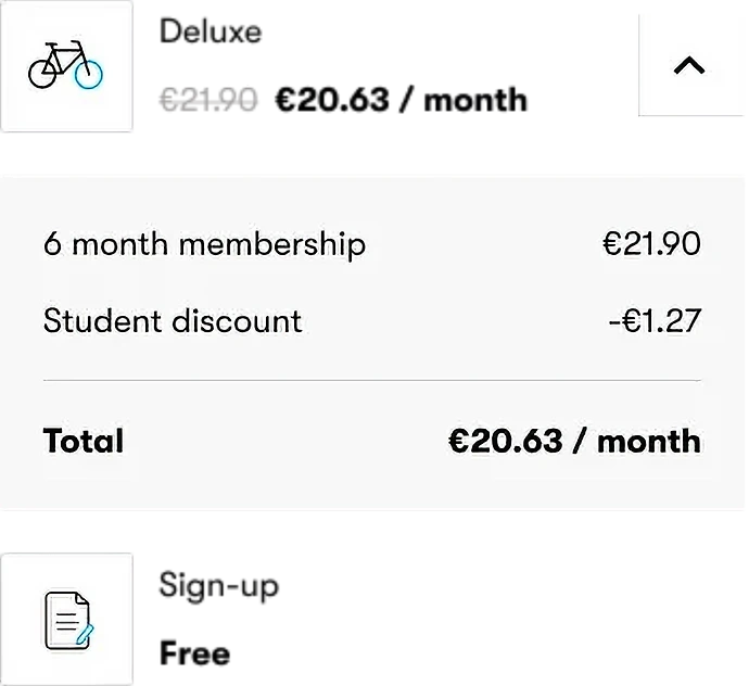
3 Tier price
Some countries offer 3 levels of promotions, how can we display this promotion without confusion?
Displaying bike picture
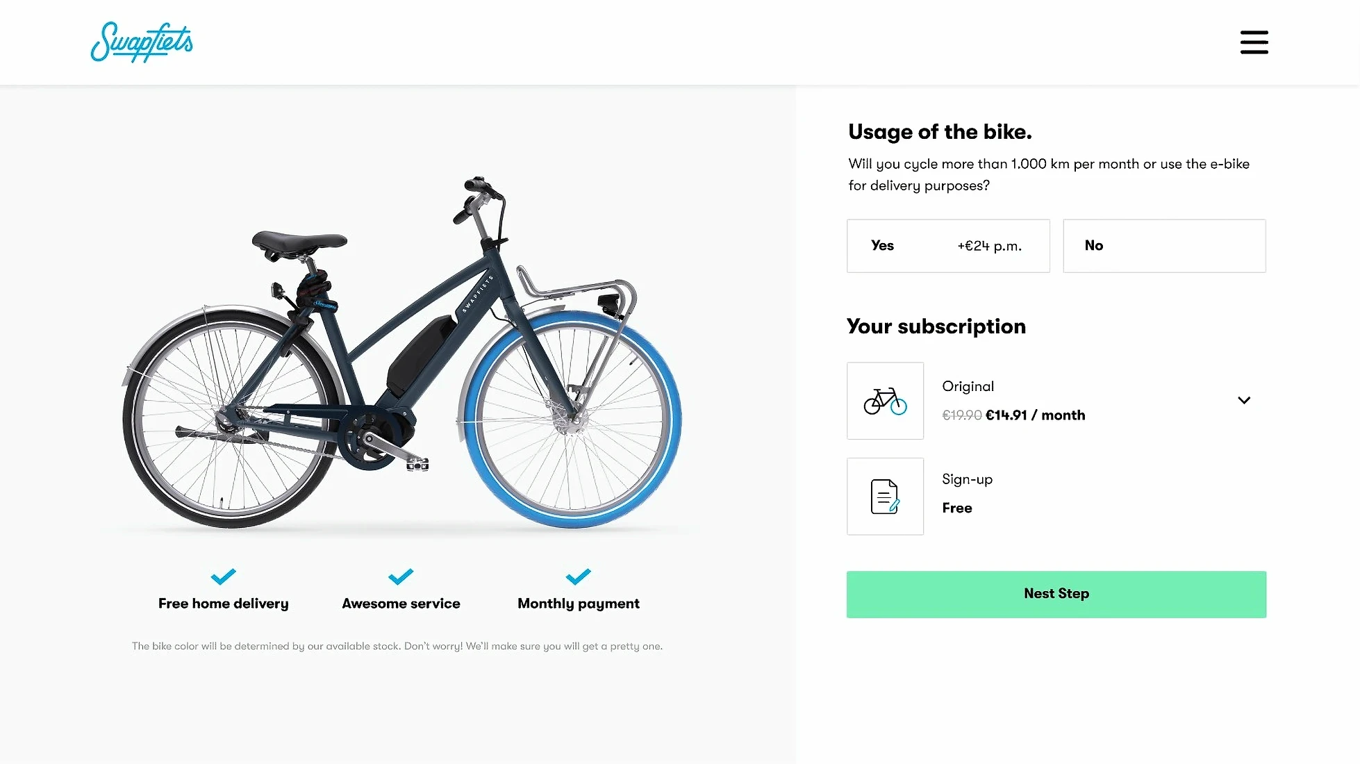
For the desktop version, we display a huge picture of the bike model on the side. This results in too many images being displayed on one page.
Multiple promotions and different promotion periods
Users need to calculate by themselves after 6-month discount price.
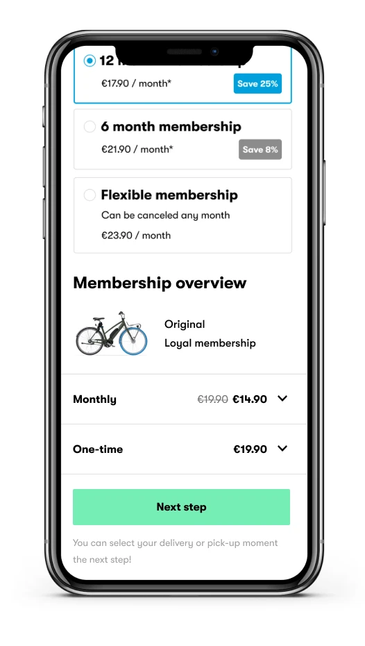
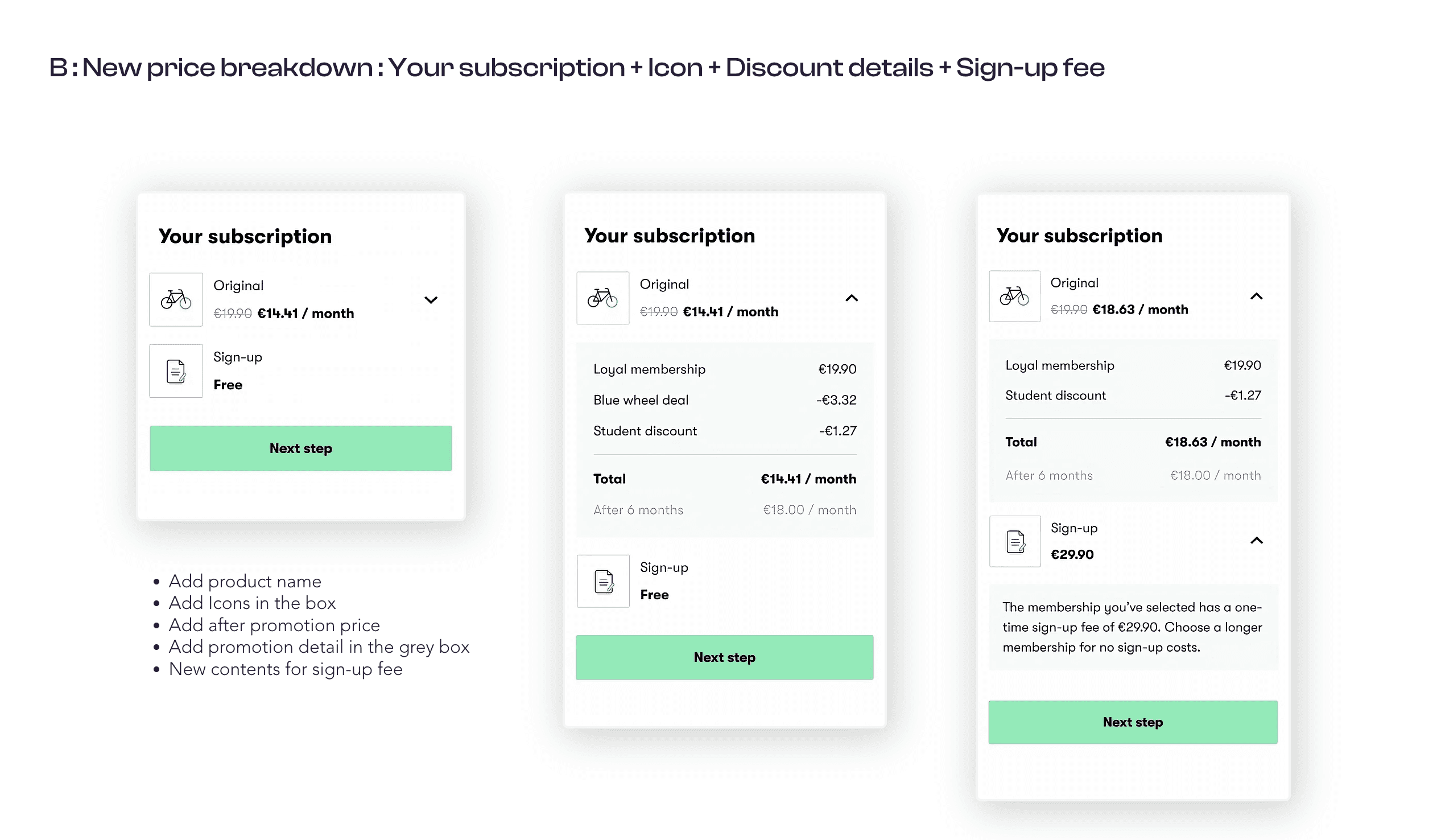
Final UI design
The final A/B test design was decided based on the feedback received from co-workers and re-examining the reference.
For the UX writing improvement, I worked with UX writer regarding the site menu titles.
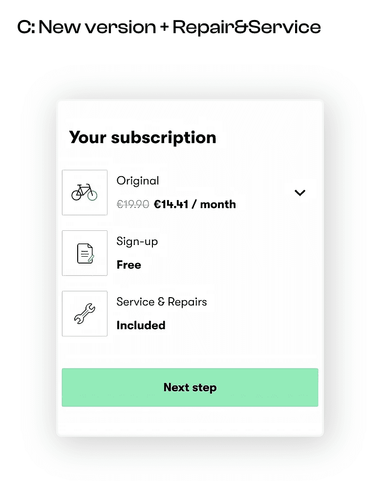
New Icon
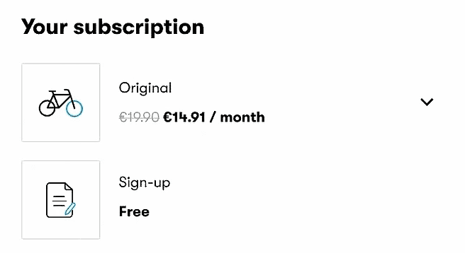
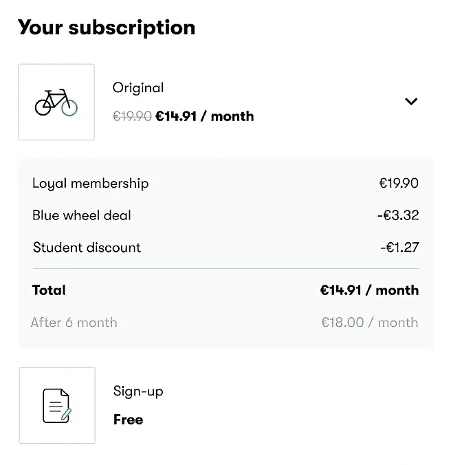
To enhance visual appeal, I added icons. Now users can easily identify which bike model they are subscribing to in the price breakdown.
Hide the detail
If we provide too much detail at the beginning, users can feel overwhelmed by the information. Using a dropdown button, I was able to hide the details.
Improved UX write
"Monthly" to "Bike model", "One-off" to "Sign-up"
User won't have question about one-off fee. When user subscribe long-term subscription, Sign-up fee is free.
"Costs" to "Your subscription"
I improved the UX writing by changing 'Costs' to 'Your Subscription,' making the price breakdown feel more like a personalized subscription summary.
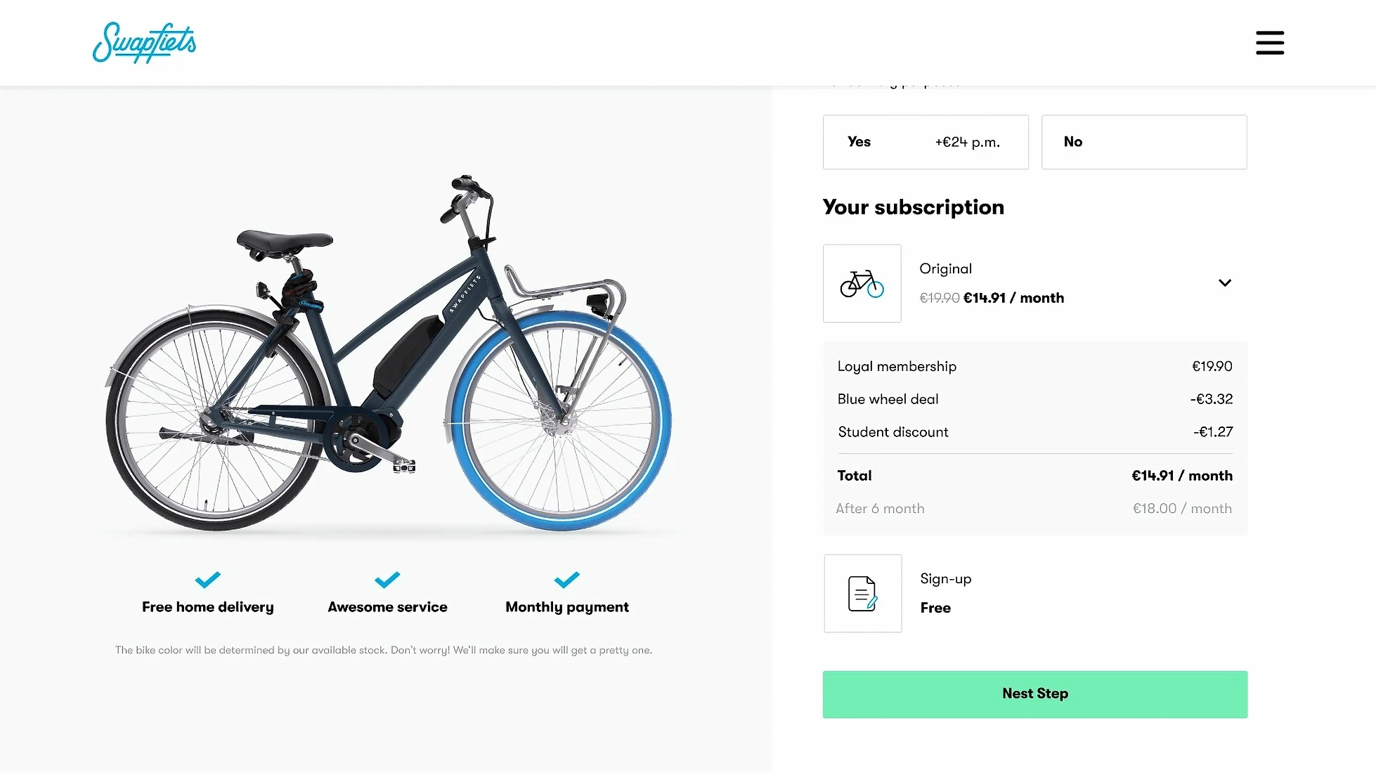
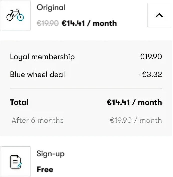
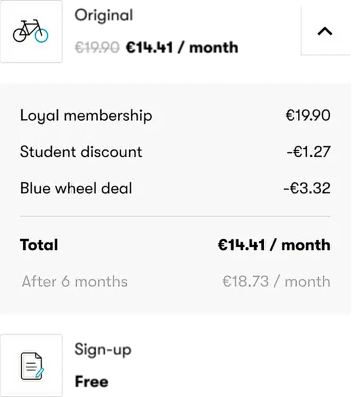
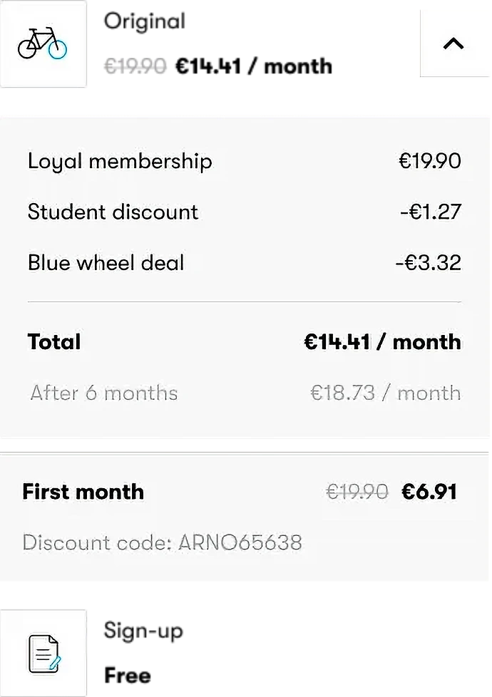
Discount detail
Add original membership prices and promotion prices. so users know how much discount is included. To clarify the price after the promotion period, we can display the post-promotion price.
Displaying discount per user scenario
While collaborating with front-end developers, I identified potential issues that could arise in various situations, such as overlapping discount periods, discount coupon, and differing discounts per country.
A/B Testing
Since we are not sure if the new price breakdown will affect the conversion rate, we will conduct an A/B test.
*A/B test duration time: 1 month
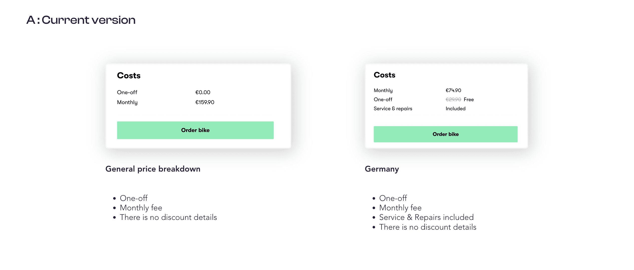
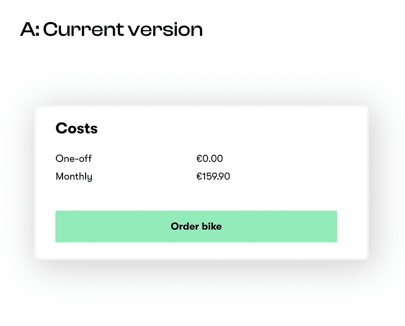
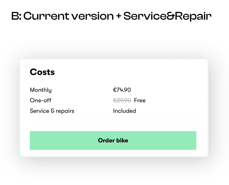
A/B Test result
We checked the conversion rate with a data analyst and found that Germany had a negative result. We assume that removing the 'Service & Repair' feature had a negative impact on the German market. However, other countries had very positive results. We decided to conduct one more A/B test for Germany.
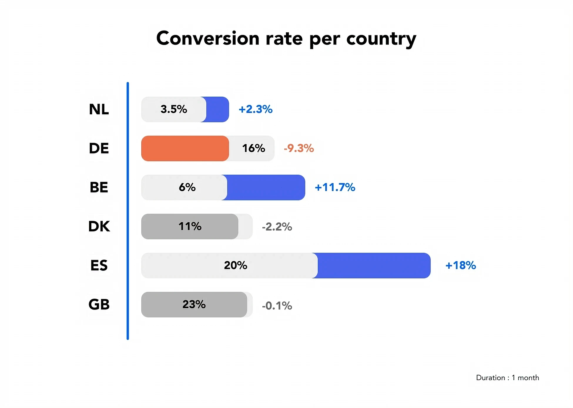
Next steps
A/B/C Test
Next StepA/B/C testWe would like to run one more A/B test for Germany to determine the cause of the drop in the conversion rate. This will be an A/B/C test. Version B is the current version with Service & Repair as it is displayed now. Version C is the new price breakdown with the Service & Repair icon. We are planning to conduct this test in the next sprint